Just My Type: An Interview with Stockholm-based Studio Reko
Art — 16.02.17
Words by Sunny Lee
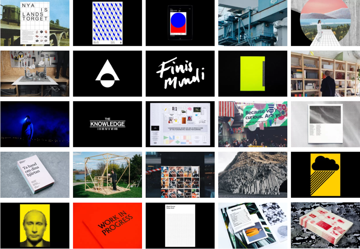
With over 44K followers on Instagram alone, Stockholm-based duo Frans Wiklund and Ludwig Mattsson of Studio Reko has amassed quite the audience for a design studio. Ranging from whimsical to minimalist, to downright horrifying, their source material upends any continuous sense of a feed. But don’t be fooled by the seductive looks – among a myriad of reasons, Studio Reko’s vibrant prints and images are anything but superficial. A rigorous study of typographical forms, without confining themselves to conventional notions of what design work typically looks like, their portfolio spans across all mediums and interests (ie: zines to furniture design). There’s clear evidence as to why they shouldn’t be pigeonholed but read on to learn about their overall design process and why Donald Glover is one of their main inspirations today.
How did you guys meet? What compelled you to start a design studio?
We met when we were both studying graphic design here in Stockholm a few years ago. About one year into our studies, we realised we were working together on virtually all projects that allowed us to do so. This, combined with the fact that neither of us had an urge to take a job at an already established studio made us start our own, Studio Reko. We both enjoy taking on a lot of responsibility and making the final calls on what to do and what not to do in projects. We are control freaks.
Where does the name Studio Reko come from?
We first saw the word ‘Reko’ on a coffee package while we were in design school. We can’t really remember what brand it was, but it kind of stuck with us. The word ‘reko’ in Swedish is short for ‘rekorderlig’ which translates into something like OK, decent, and reliable. We chose the name early on and saw no reason to change it now, even though we could probably come up with funnier names.

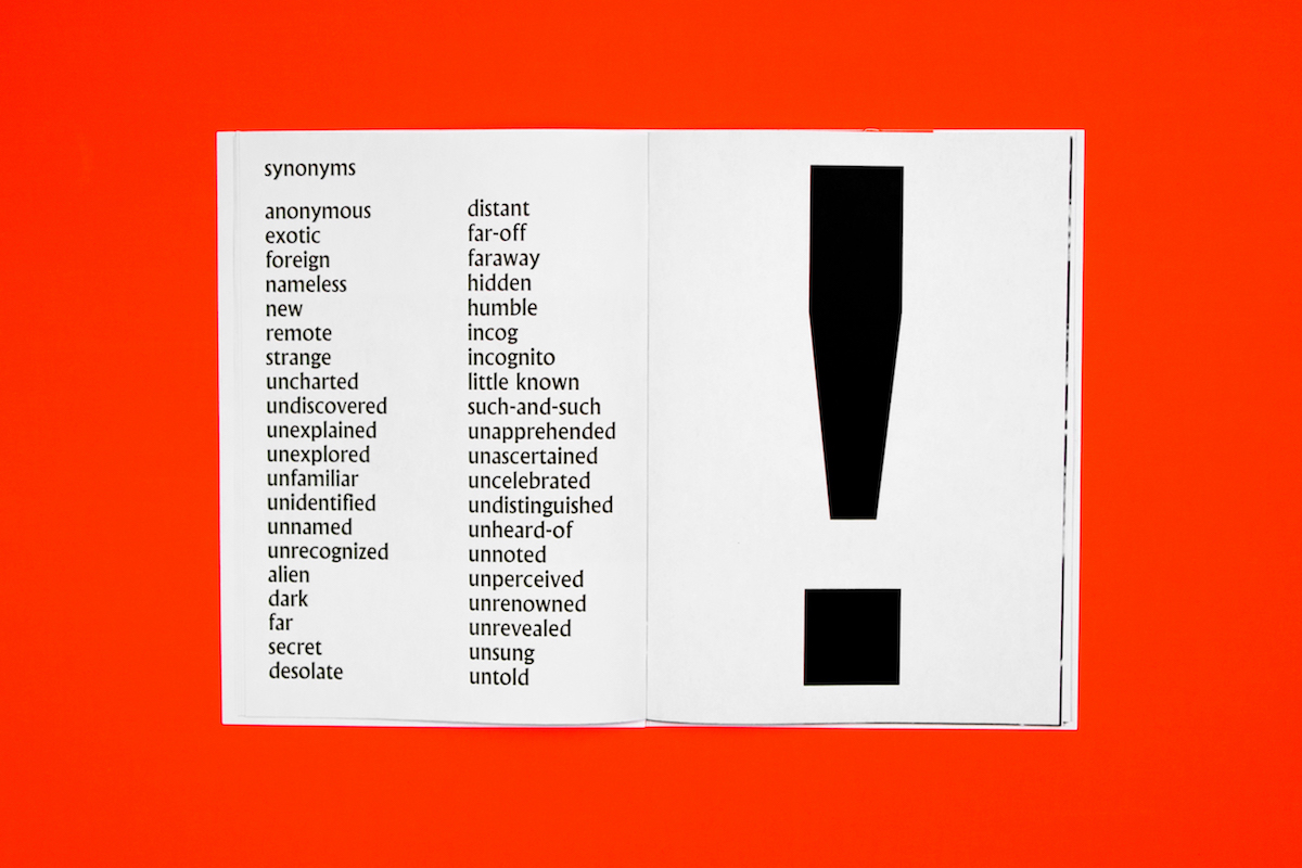
Derivé, Publication. In collaboration with Mattias Green and Carl Herner. 2015.
How would you best describe your aesthetic? How is Studio Reko changing since its inception?
Our aesthetic revolves a lot around strict traditional typography and being more experimental in colours and imagery. We wouldn’t say that our aesthetic has changed as much as it has evolved since we started out. We are still very focused on typography but have a wider range of influences nowadays.
How does your creative process generally work? Similarly, how do you guys work together? Are you both having a conversation throughout each and every project, or does someone take on specific projects, etc.?
When we start a new project, we usually sit down, just the two of us, and start talking about the outline and the different subjects that the project touches upon. After that, we spend some time on our own to work out ideas and visualise them in some way. When we both feel like we are onto something, we share our ideas and thoughts with each other and usually end up talking about the pros and cons of every idea. When we have reached some kind of mutual understanding on which ideas work best, we improve them further by working on each other’s sketches. That usually leads to the final result.
We always work together in the beginning of a new project to develop a solid concept/idea. When that is done, and we both feel satisfied with the way the project is going, we split up to be able to work on multiple projects at once.
How do you decide which projects you want to do? What is the collaborative process like with the client? Can you walk me through two or three of your favourite projects? How did the idea start? What makes it your favourite?
The most common way is that someone approaches us and, if we think it sounds fun and we have the time, we accept it. The collaborative process with the clients differs a lot from time to time. Sometimes the client doesn’t want to be involved and wants us to do everything. But since our clients often work within the cultural sector (artists, designers, musicians, writers, etc.), they are used to being involved in the process themselves; in those cases, we like to collaborate with the client, as long as we have the final call on all aspects concerning graphic design.
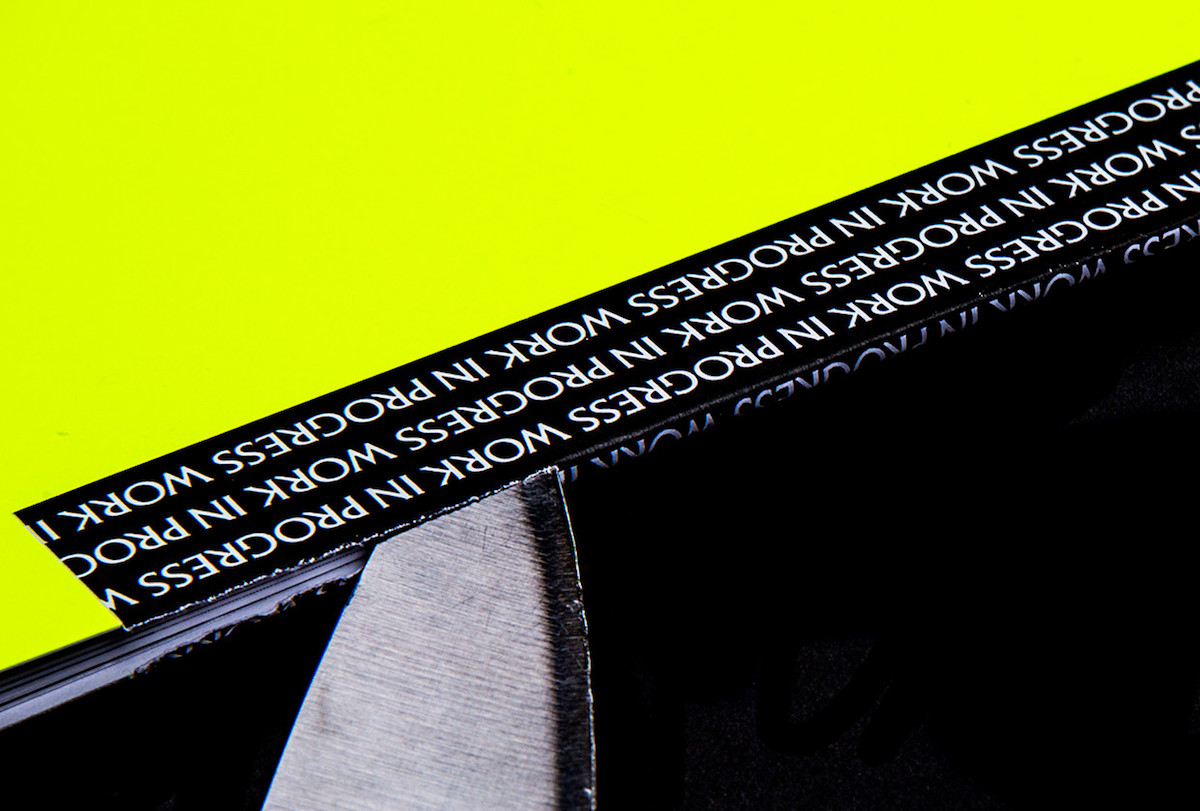
WORK IN PROGRESS I, Publication, 2015.
The typography in both your printed and online works is simply amazing. Can you tell me more about how you approach fonts? Do you design typefaces?
First of all, thank you! We have always believed that typography is the very foundation that good graphic design is based on and, as a result, we devote a lot of time in all our works. We pretty much use one classic sans-serif in most of our own work. With clients, we work with a larger variety based more on their needs and what they want to communicate. We have designed a few fonts of our own for clients, but nothing that is available to the public.
The e-commerce site is great—has it helped your practice? Do you have any other stockists? Is this a larger goal of the firm?
E-Commerce is not something we have spent very much time on developing, but we are planning to do so in the future as we create more posters and other prints. We sell some of the earlier posters we’ve made through stockists in Poland and Germany, but the plan is to focus on our own shop in the future.
That’s exciting. Can you tell me more about what kind of shop you intend of opening?
Our current webshop (e-commerce) has an active print focus where we sell our posters and fanzines. In a not too distant future, we will re-design this shop and have a wider range of products. For example, we are in the middle of designing our first piece of home furniture (a table with matching stools), a coffee-table photo book (kept secret for now), and a few pieces of clothing.
WORK IN PROGRESS II, Publication, 2016.
I also read that your fanzine sold out. Any more to come?
We did our first fanzine as a studio in our last semester in design school, which sold out in like a day – that came as quite a surprise. We have done one more edition in that same series called “Work In Progress II”. That’s still in stock as we printed a lot more of that one.
Fanzines are an excellent way to get started when you haven’t really got any clients but still need to get your work out there. We have no plans on creating a new one at the moment, not because we don’t want to; we simply have too many other fun projects at the moment.
How did you get into furniture design? (Is there anything you guys don’t do?)
One of the reasons we started Studio Reko was that the everyday work of a regular design agency didn’t really cover what we wanted to do in design. We want to work in as many fields as we possibly can, as long as we think it’s fun. As a result, we’ve tested out a lot of different areas of the design world such as print, web, photography, furniture, film, fashion, and motion graphics.
Conclusion: We want to do it all, and more.
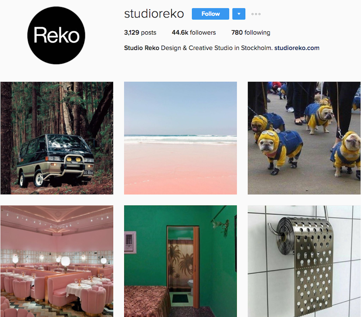
So about that Instagram account — it’s uncanny in the best way (and what drew me to your work in the first place). When/why did you start one? How do you position your account with the rest of your studio’s practice? (It seems a bit more playful than your site portfolio — was that intentional? Is it some sort of outlet?) Where do you find all these great disparate images? What “standards” does an image have to meet to make it onto your account?
Thank you, we are glad you and apparently a lot of other people seem to enjoy it. We started the account the same day we decided to start a studio together. Our Instagram account serves as our moodboard in our daily work. This is where we upload images that we find when we are looking through our feeds, and where we find inspirational for some reason, even if we can’t really use them in our work. It’s high and low in a way that we can’t always let our work be, like dogs covered in bubble wrap meets the legends of the design, film, fashion, and art world.
We mostly find them while researching or directly from blogs on the internet. Lately, we’ve gotten more and more submissions from followers that like what we are doing and take the time to send us images they think we would like. We love that. The only ”standards” the images need to meet are our own.
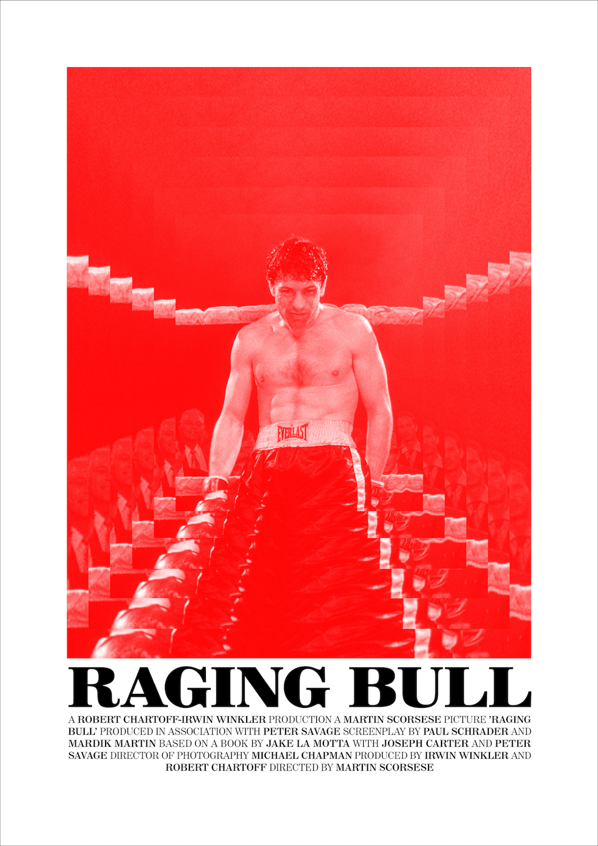
1980 Raging Bull, Poster, 2016.
What has been inspiring you lately (in art, music, fashion, or otherwise)?
We are both film geeks, to say the least, so that is always a big source of inspiration. Someone who inspires us right now is Donald Glover. He’s obviously talented but, most of all, we admire that he doesn’t work in just one field. He seems to do everything he can and wants regardless, when it comes to acting, writing, producing music, or directing. Other than that, we try not to look too much at what other designers in the same field as us create. But AG Fronzoni’s work has always mesmerised us.
Studio Reko works with brand identities, commercials, photography, websites, films, books and objects for clients and themselves. If you are interested in a collaboration, please get in contact .